Free Ground Shipping on Orders Over $49 Details & Exclusions Excludes Curb Side Delivery (LTL). Lower 48 United States Only. • NEW! Shop The Summer Lookbook
Feb 5, 2021
Why Pantone’s Colors of the Year Are About to Illuminate Your Home
Every year we look forward to Pantone announcing their selection for Color of the Year (COY). This year, we’re calling it Colors of the Year. That’s because for just the second time in 21 years, Pantone has chosen two colors for 2021: Illuminating and Ultimate Gray. Now you may be thinking: Wait a minute! These two colors are so obviously different. While that’s true, together this dynamic duo complement each other beautifully, while bringing a warm, optimistic message of hope and strength for the year ahead.
Here we take a closer look at color fundamentals, starting with the color wheel. We answer age-old color questions like: What are warm colors and cool colors…and how you can use the Pantone’s chosen colors to complement a wide range of colorful lighting and design styles to brighten up your own living spaces?
Color Theory 101
Does your heart skip a beat whenever you think of choosing colors for a room? Using a color wheel takes the guess work out of picking colors for your interior design color scheme.
It’s no accident that certain groups of color look good together and understanding these basic groups will give you a foolproof way to decorate with color.
Warm vs. Cool Colors
The color wheel divides color into two sides; one side has all the warm colors, and the other side has all the cool colors.
What Are Warm Colors?
Warm colors are reds, oranges and yellows. Want to make a large, sparse room cozier? Paint it in a warm color.
Generally, these colors make us feel happy, energized and enthusiastic. They encourage warm, social activities, making them a great choice for living rooms, dining room and kitchens.
What Are Cool Colors?
Cool colors on the wheel are blues, greens and violets. While warm colors cozy up a space, a cooler paint color will make a small powder room or bedroom seem more spacious.
As for how they make us feel, think: calm, cool and collected. Cool colors tend to calm our emotions and help us to focus.
One final note about decorating with warm and cool colors: Never use just one! For a cozy room use mostly warm colors with a few cool colors added in. Balance and contrast are important elements to any interior design color scheme.
Tint, Tone and Shade
The colors on the outer parts of a color wheel are pure colors or hues. Adding white to a color lightens it, giving it a different tint. The more you add white, the lighter the tint. Tints are often associated with pastel colors because they are soft and subtle. Example: Pink is a red tint.
When you add gray, it changes the tone. Tones have the same qualities of a pure color but are not as intense, they are “toned down.” Most of the colors we see every day are tones of a pure color.
Adding black to a color increases its darkness, creating a new shade.
Example: Maroon and navy are shades of red and blue.
What about Gray?
If your color wheel shows the gray scale, you’ll see that the cool range starts with white. And what are warm colors of gray? As the gray value gets darker, it becomes a warm color.
Complementary Colors
There are different ways to discover complementary colors on the color wheel. One way is to use colors that are directly opposite each other – like blue and orange.
While these two hues in their original colors might not be what you had in mind, this is where tints and shades come in. Picture a blue velvet sofa and ottoman with an orange-brown leather chair.
Another way to use the wheel to find complementary colors is to use Analogous (similar) color grouping. Try this yourself by using three colors found next to each other.
Illuminating: A Bright Yellow Hue
For the 2021 COY, Pantone wanted to send a message of hope and good cheer. Illuminating is a bright shade of yellow that evokes the optimistic promise of sunny days ahead.
Yellow is one of the three primary colors (with red and blue). On the color wheel yellow complements purple. But why limit yourself? Using the analogous color grouping (three colors found next to each other on the color wheel) you’ll find that green also complements Illuminating.
And what about white? You might say it goes with everything, but did you know that green, blue, red, brown and yellow especially pop in a white room?
Our Complements to Illuminating
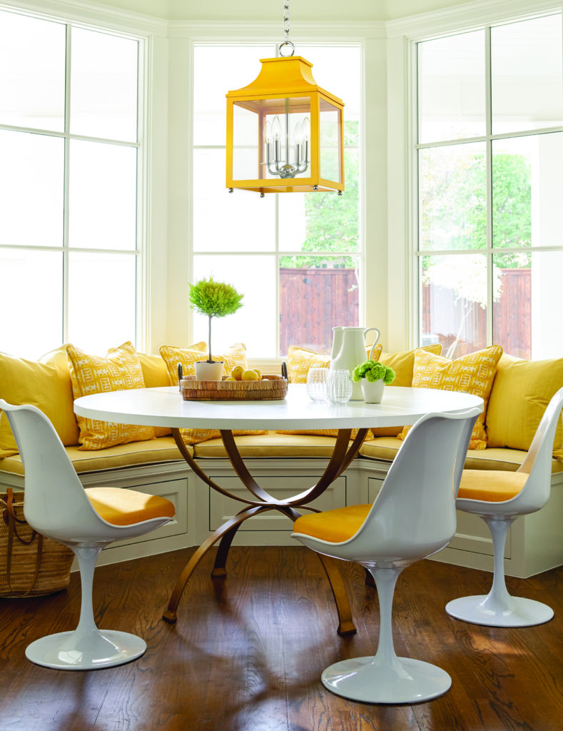
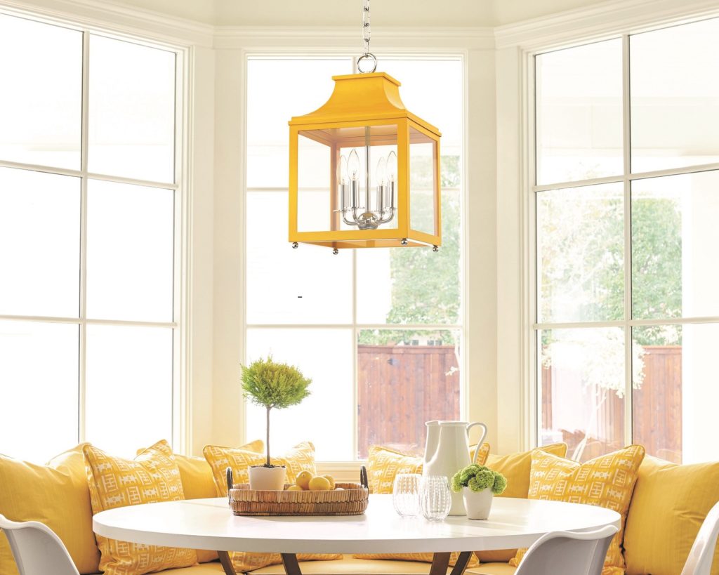
Leigh 16 Inch Cage Pendant by Mitzi
A splash of yellow goes a long way with white. Lofting a bright yellow lantern like the Leigh 16 Inch Cage Pendant by Mitzi overhead brightens a breakfast nook, giving it sunny coastal vibes. Matching yellow seat cushions and window seat pillows in different tones really maximize the power of this color scheme.
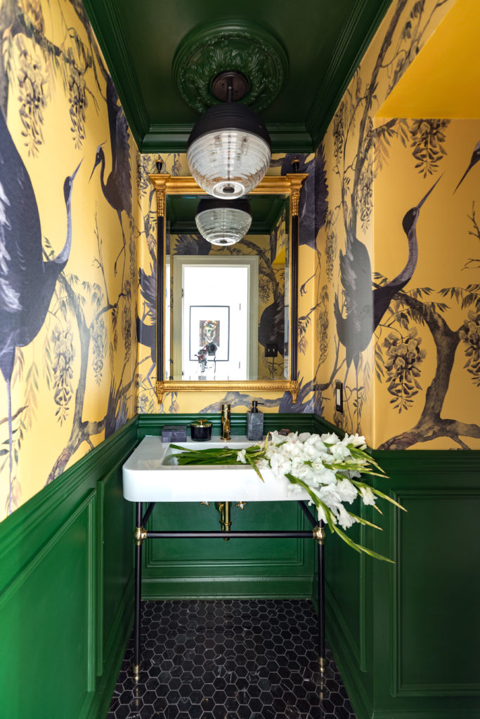
Easton 14 Inch Large Pendant by Hudson Valley Lighting
Image Credit Required: Homeowner: Jewel Marlowe of Jeweled Interiors
A bold yellow wallpaper with swooping gray and black cranes combined with rich green molded paneling brings a glamorous Art Deco vibe to this stunning powder room. A large, modern fixture like the Easton 14 Inch Large Pendant by Hudson Valley Lighting illuminates the dark, dramatic room. Its honey dipper shape adds a fun touch, and the black finish is the perfect anchor to the yellow paper.
Pantone’s Ultimate Gray
While yellow has been a Pantone’s Color of the Year before, it’s the first-time gray has made the honor roll. Ultimate Gray represents solid, dependable elements which last forever.
Like the color of pebbles, which stand the test of time, Ultimate Gray has universal appeal. It pairs seamlessly with every color in the rainbow and still looks balanced.
The Ultimate Gray Decorating Guide
Carpara 13 Inch Table Lamp by Eglo Lighting
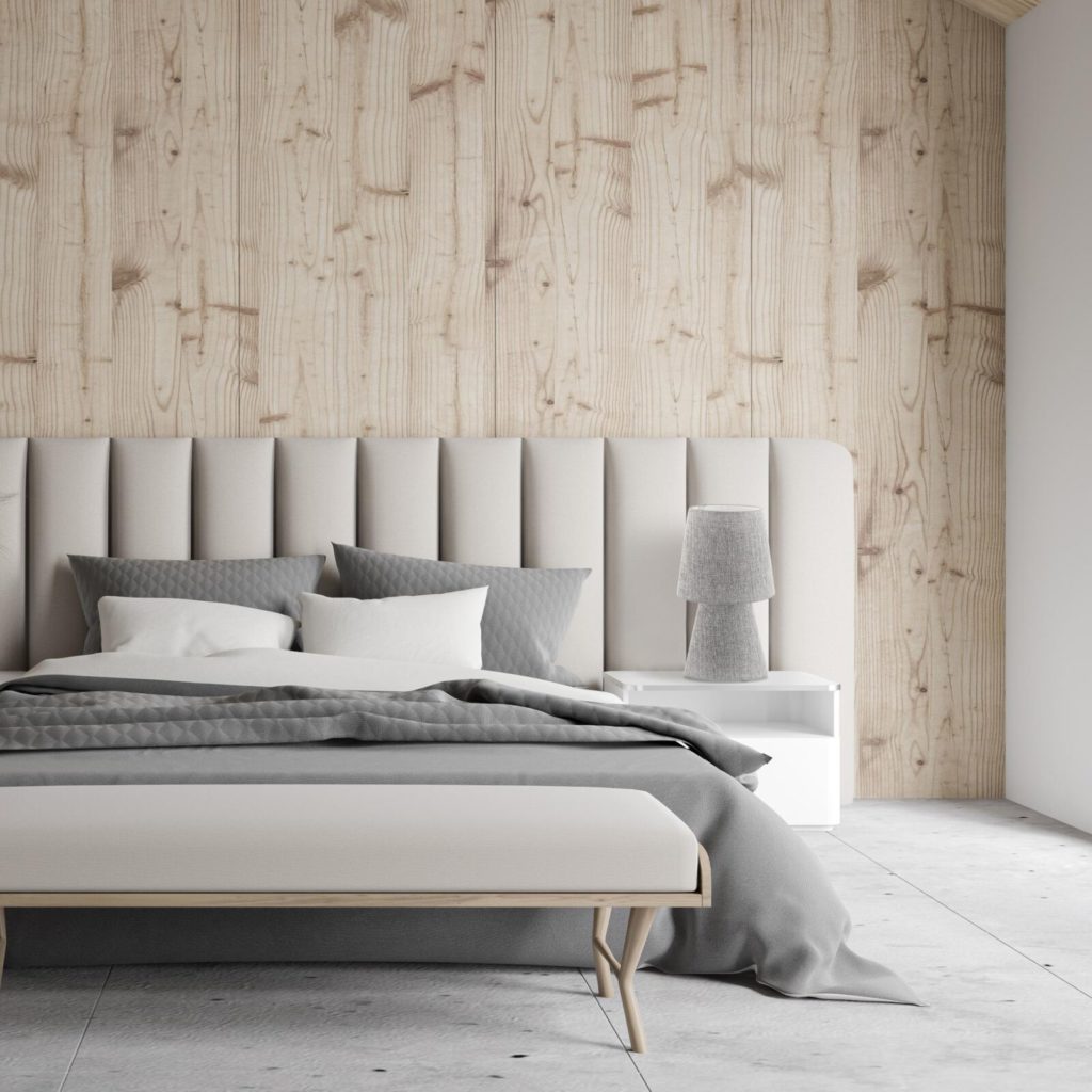
A soothing color palette turns this bedroom into a tranquil haven. A study in shades of gray, a stylish gray ceramic lamp with a fabric shade provides bedside light.
Gray is the perfect anchor to this neutral room, letting the gorgeous wood-patterned statement wall take center stage.
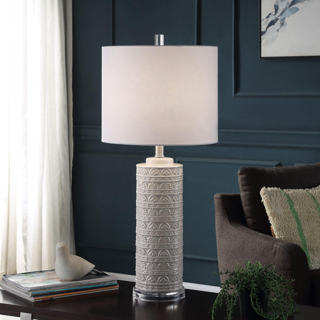
Frezzi 30 Inch Table Lamp by Stylecraft
A dark teal room with gray artwork and highlights throughout feels warm and inviting. Layered lighting like wall sconces, floor lamps and table lamps offset dark walls. The textured Frezzi table lamp is the ultimate chairside companion.
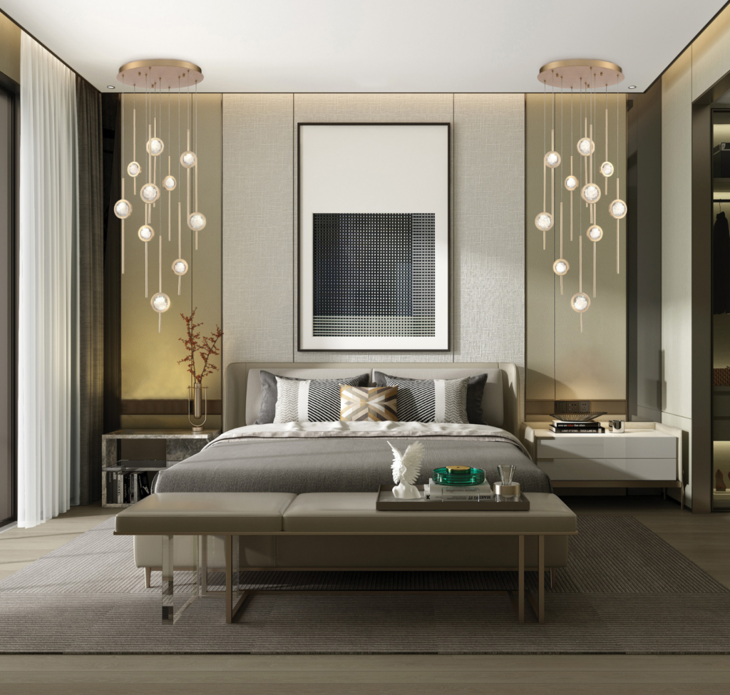
Radiance 12 Inch Mini Pendant by Justice Design Group
From the color-blocked accent wall to the sleek furniture, this cool mid-century modern room shows just how well paring gray with sunny yellow can enliven a space. Artwork and pillows add pops of yellow and the black biomorphic shape of the Radiance Mini Pendant anchors in the look.
While yellow has been a Pantone’s Color of the Year before, it’s a first time for gray. Gray isn’t exactly a newcomer to the interior design scene, it’s been around for many years now. It looks like Pantone is saying that it’s here to stay, for a least a few more years.